NG DialogPack Guide
TNGTaskDialog
TNGTaskDialog is a dialog component, which implements features, provided by Microsoft Windows Vista Task Dialog API. The component is used to show Windows Vista (Windows 7) like dialogs, which are usually used to show some information to the user, like warning or error message, or to request the user to make a choice by asking some question.
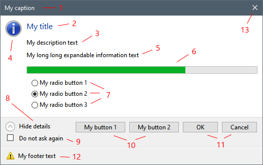
The dialog surface can contain a variety of standard elements, however usually they are not used all at ones. Full task dialog structure is shown below:


1)Dialog form caption. Use Caption property to specify the caption text.
2)Dialog title. This is short main text. Use Title property to specify it.
3)Dialog description. The description is a longer text, which describes the required action more precisely. Use Text property to specify it.
4)Main dialog icon. The dialog can show no icon, one of the standard icons or a custom icon. To specify one of the standard icons use MainIcon property, to specify custom icon - use CustomMainIcon property. Note, that setting one property will reset another. The icon is always re-sized to standard size, which is usually 32x32 pixels.
5)Additional expandable text; can be specified using ExpandedInformation property. This text can contain even more long description. Usually this text is not visible (collapsed) until the user click on expand button (8). Expand button (8) is not shown if ExpandedInformation property value is set to empty string.
6)Progress bar. Has a variety of properties, such as Min, Max, Position, State and Marquee. For showing progress bar the user should include tdfShowProgressBar value into Flags set property. The timer feature can be used to update progress bar state during dialog execution (look at Advanced Features for more information).
7)Radio buttons. Radio buttons can be configured using RadioButtons collection property. The collection allows to add/remove radio buttons, which are of type TNGTaskDlgRadioButtonItem class. Caption and Enabled state can be specified for each radio button. As well a radio button have Default property, which can be set to True to specify initially selected radio button; setting this property to True for one radio button will reset it to False for all others.
8)Expand/collapse button. This button is shown when ExpandedInformation property is set to non empty string. It allow to expand or collapse (show or hide) additional expandable information (5). The caption of this button in both expanded and collapsed states is set automatically by OS, but can be customized using ExpandButtonCaption and CollapseButtonCaption properties.
9)Verification check-box. This check-box is shown when VerificationText property value is set to non empty string. Check-box checked status can be controlled using tdfVerificationFlagChecked dialog flag.
10)Custom buttons. Custom buttons (as opposed to standard buttons(11)) are additional dialog buttons. They can be configured using CustomButtons collection property. CustomButtons collection allows to add/remove custom buttons, which are of type TNGTaskDlgButtonItem class. Caption, Enabled and ModalResult properties can be specified for each custom button. Usually the user should specify unique modal result for each custom button to be able to know, which button has been pressed during dialog execution. As well a custom button have Default property, which can be set to True to specify the default button; setting this property to True for one button will reset it to False for all others. Also, task dialog provides an option to show custom buttons as command links (14).
11)Standard buttons. Can be specified using Buttons set property. Standard buttons can't be disabled, and as well, standard buttons has standard modal results. For example, tcbOk button will have mrOk modal result. One of the standard buttons can be set as default using DefaultButton property. Setting the property will reset Default property in all custom buttons (and vice versa). If there no standard or custom buttons configured, OK button is automatically added.
12)Footer. The footer contain FooterIcon and FooterText. The footer is shown only if FooterText property contains non empty string value. Footer icon can be one of the predefined icons or a custom icon just like main icon (4). The icon is always re-sized to standard size, which is usually 16x16 pixels.
13)Standard Close window button :). However, there is an important note: clicking on it will fire OnButton click event handler with mrCancel modal result. Just like with other buttons, the user can set CanClose event handler parameter to False to prevent dialog closing (look at Advanced Features for more information).
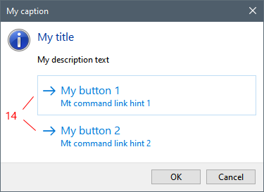
14)Custom buttons shown as command links. Task dialog allows to show custom buttons as command links. To achieve this tdfUseCommandLinks dialog flag should be used. Usually command links show provided by OS standard arrow icon, however, the user can hide these icon using tdfUseCommandLinksNoIcon dialog flag. Command links provides additional hints, which are longer text descriptions. They can be specified using CommandLinkHint button property.
Platform mode
As has been noted above TNGTaskDialog is based on Task Dialog API, which was first found in Microsoft Windows Vista. To allow our component be usable on previous OS version, such as Windows XP, we implemented fully native emulation mode. This mode can be turned on explicitly or will be used automatically if platform API is not available (on Windows XP). To turn emulation mode on the user should set PlatformMode property to tdmNever.
Dialog execution
TNGTaskDialog component can be placed on the form and configured using Delphi's Object Inspector or dialog component editor. The dialog can be also configured in code, using Fluent Interface. Anyway, after that the dialog should be executed. The dialog can be executed by calling Execute method, which works like standard ShowModal method, and will blocks until dialog is closed. Execute method returns modal result value, which specifies, which button has been pressed. Returned modal result can be one of the standard predefined values, such as mrOk, mrCancel, mrYes, mrNo, ect. Or, it can be a value specified as ModalResult property value for a custom button.
Note, that is no custom buttons was specified and standard buttons Buttons property has been explicitly reset to [] empty set, then Ok button will be implicitly added. So, be prepared for mrOk return value in this case.
Also, remember, that standard close window button (13) works as a Cancel button. So, be prepared for mrCancel return value.
Among return value of Execute method, the dialog provides some additional properties, which describe dialog resulting state. These properties are:
•ModalResult - same as Execute method return value.
•Clicked - provides a reference to last clicked custom button, or nil - if one of the standard buttons has been clicked. However, its a good practice to assign unique modal result values for each button. For custom buttons values can start from some number, which is guaranteed to be greater than all standard values. For example, use the values >= 100. In this case Clicked property is basically unneeded and all decisions can be made based on ModalResult purely.
•Selected - provides a reference to selected radio button. Unlike buttons, radio buttons has no modal result, however, since they are collection items, standard Index method can be used. So, Selected.Index can be used to organize case/of construct with constant numeric values.
Note that TNGTaskDialog supports advanced execution features, like timer, OnButtonClick event and navigation.